Category
Editorial Design
Duration
4 Days
Back to portfolio
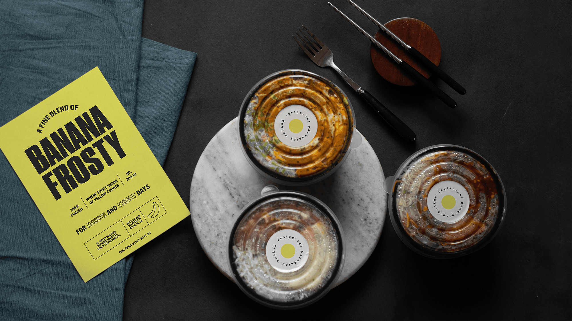
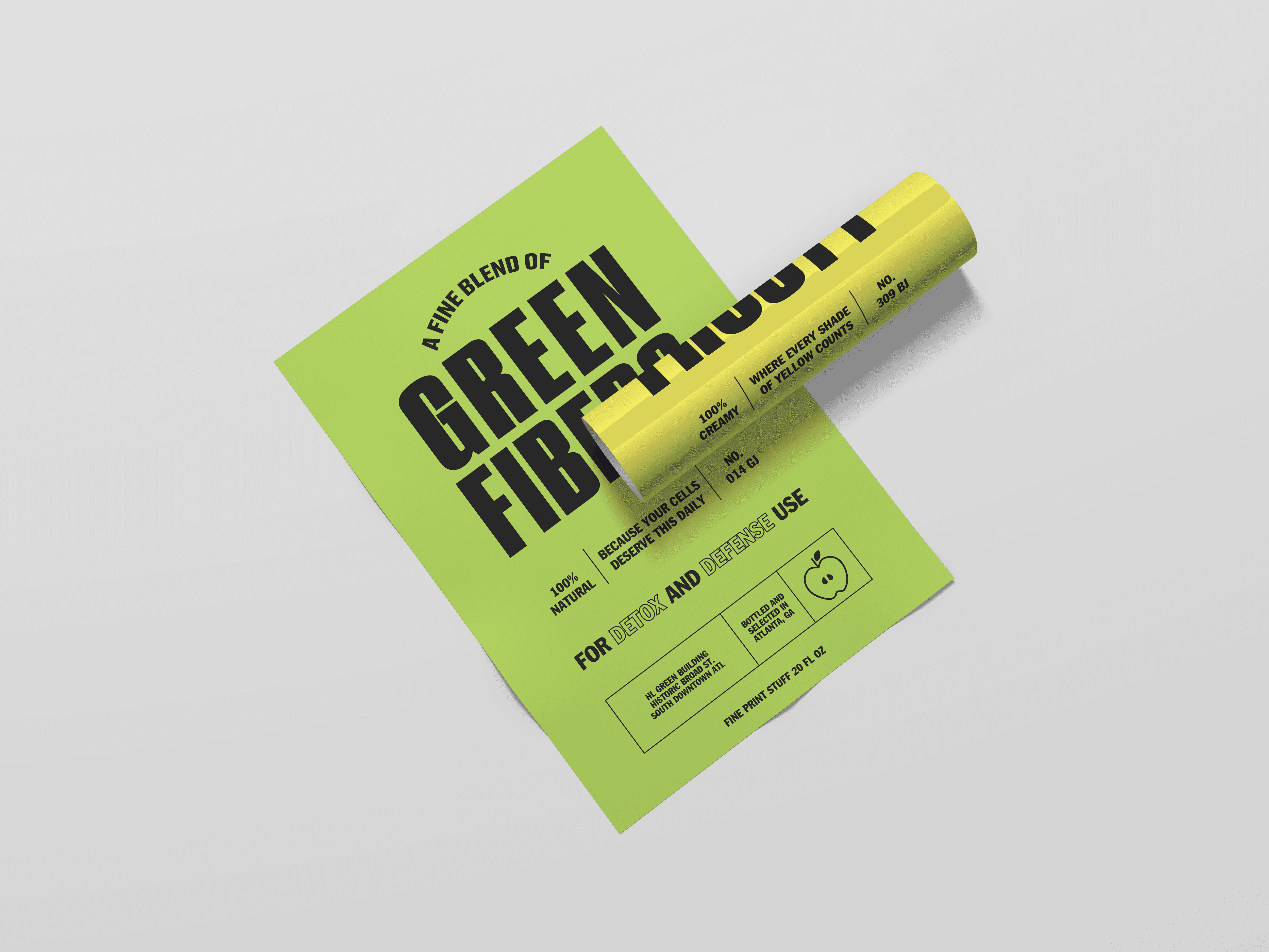
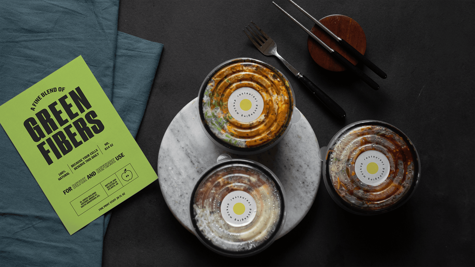
Squeeze Co.
Crafted for those who take freshness seriously, Squeeze Co. is where refined taste meets timeless design. With curated palettes, minimalist labels, and carefully structured typography, it’s more than juice, it’s shelf-level elegance in a bottle.
How We Helped
The client approached us with a vibrant line of natural juice blends and a need for bold, differentiated brand visuals that could stand out on shelves, in cafés, and on digital.
Their key challenge: striking the balance between playful and premium, while clearly communicating health benefits and product origins.
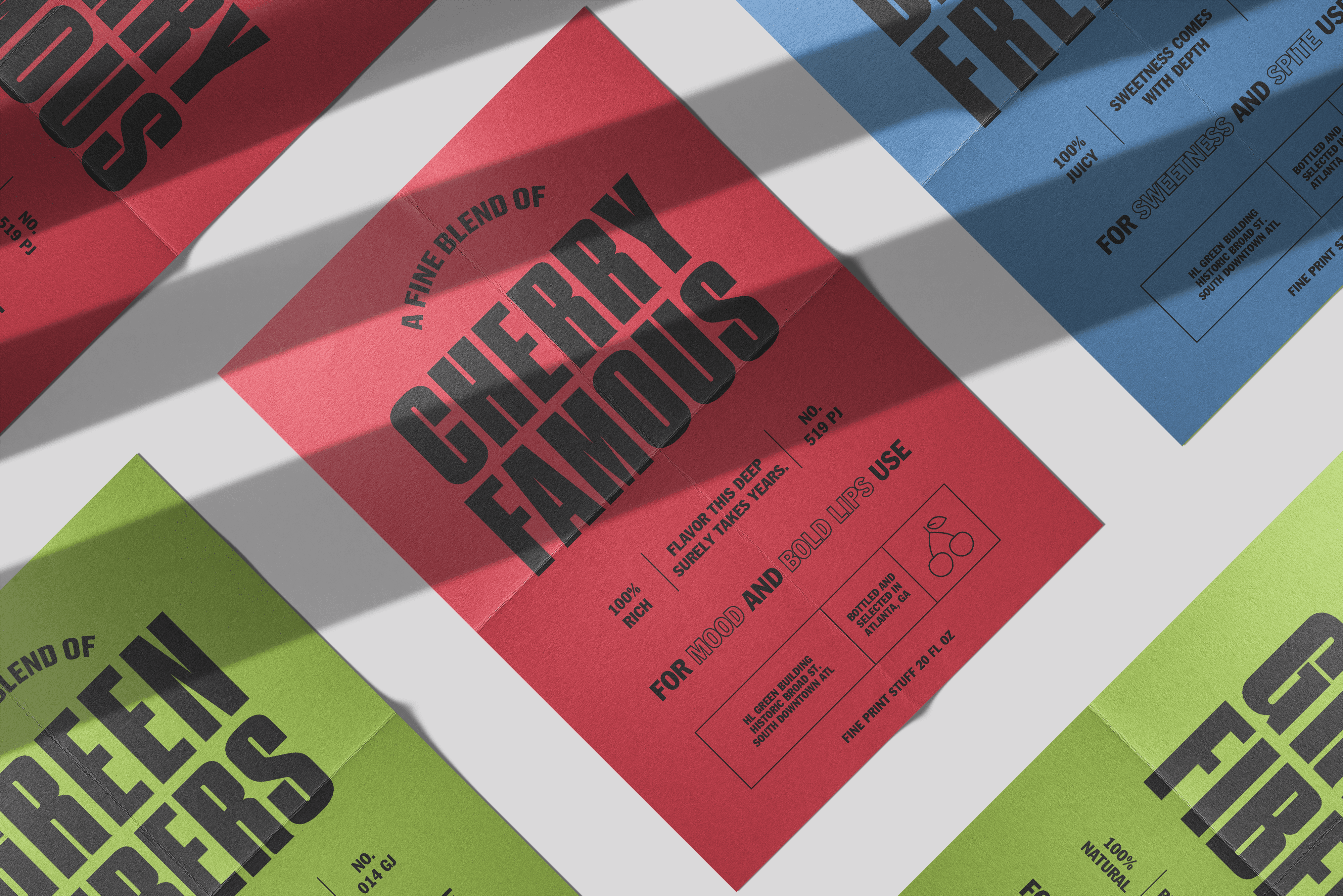
We stepped in to craft a visual system that felt fresh, fearless, and functional, rooted in energetic typography, a modular layout system, and color palettes aligned to each flavor profile.

What We Delivered
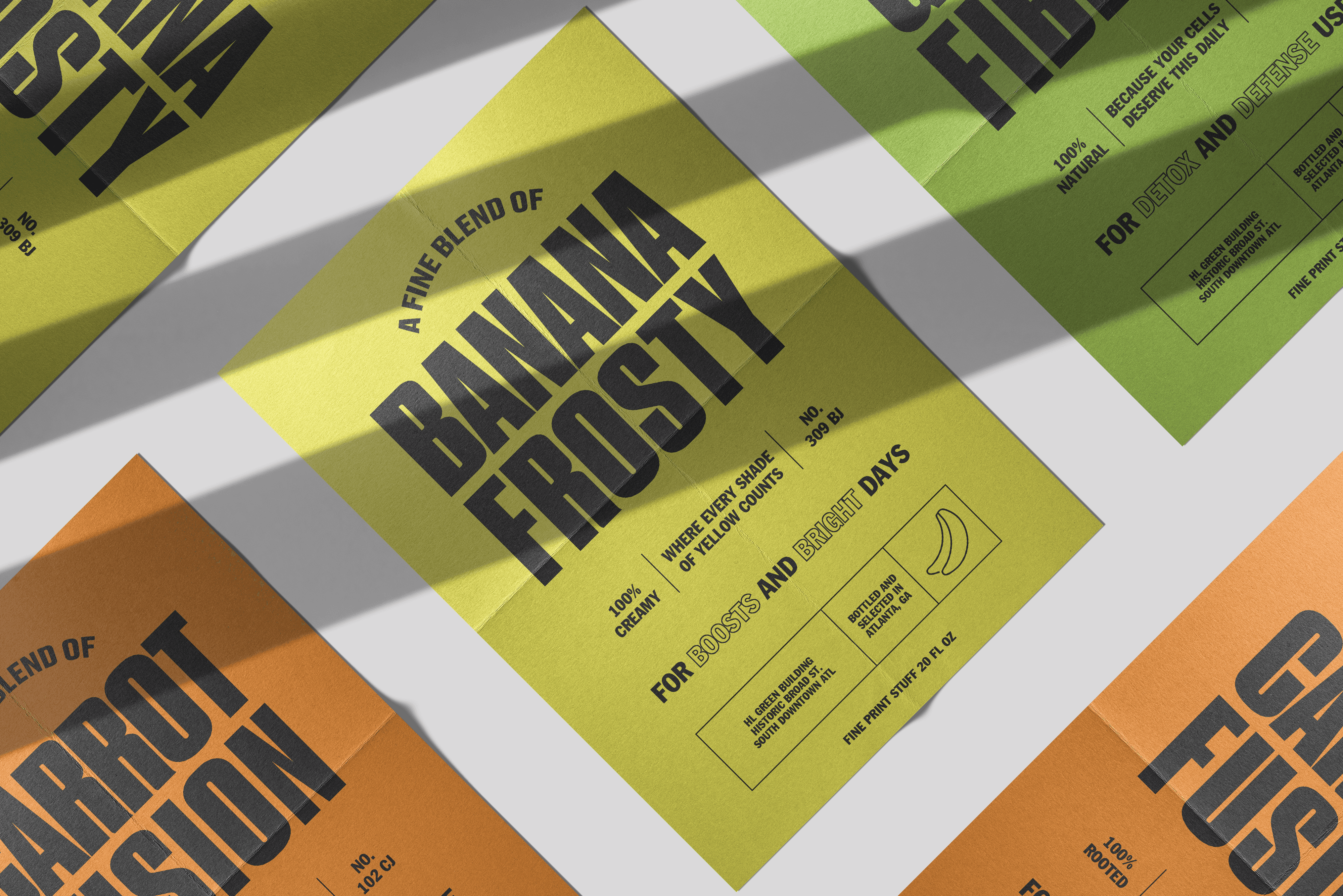
A series of product posters for each juice blend, starting with Banana Frosty
A flexible typographic layout system that could scale across all product variants
Custom copywriting with a friendly, health-forward tone
Defined color-coding strategy to match ingredients with visual hues
Print-ready assets optimized for both folded in-store posters and flat digital use
The Results
Created a visually unified system across 5+ products, increasing brand recall
Boosted shelf appeal through color-coded, attention-grabbing layouts
Supported client’s launch in retail with ready-to-go marketing assets
Received positive customer feedback for feeling “fun, but not childish” and “freshly premium”
Posters were reused as part of a content series for social and campaign rollout
+45%
Customer Recall