
Category
Experimental Poster
Duration
4 Days
Back to portfolio
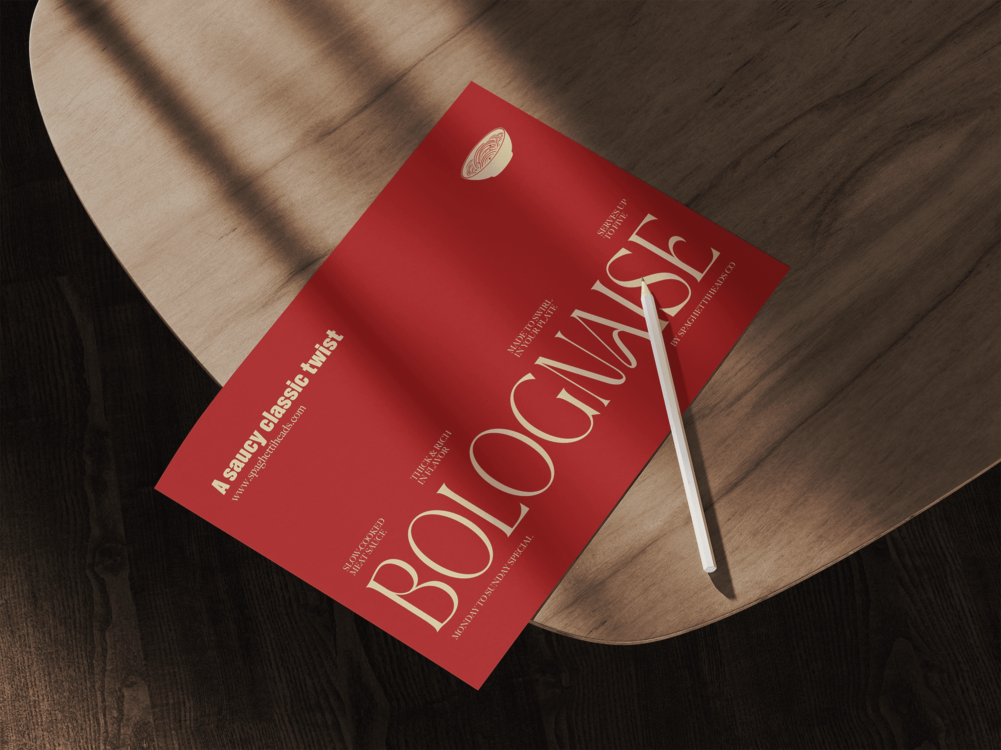
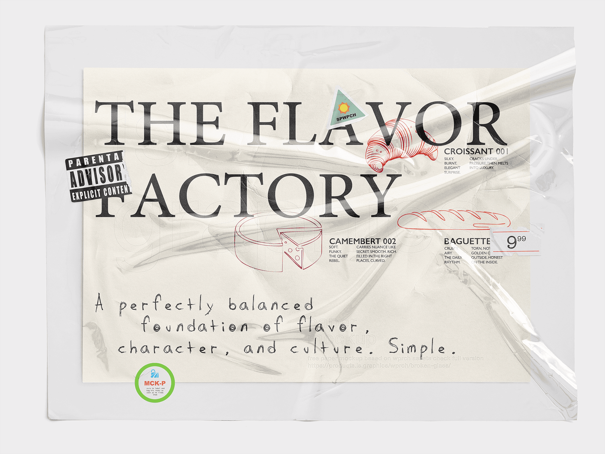
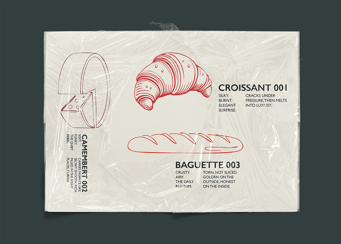
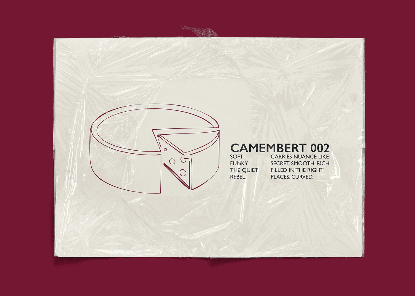
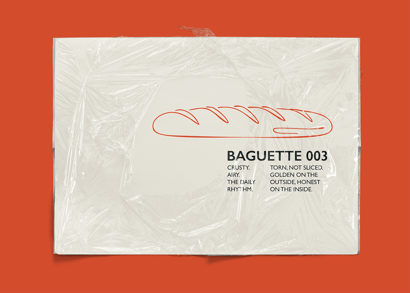
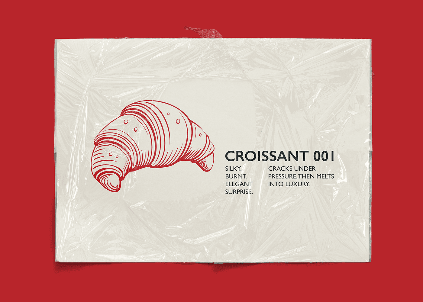
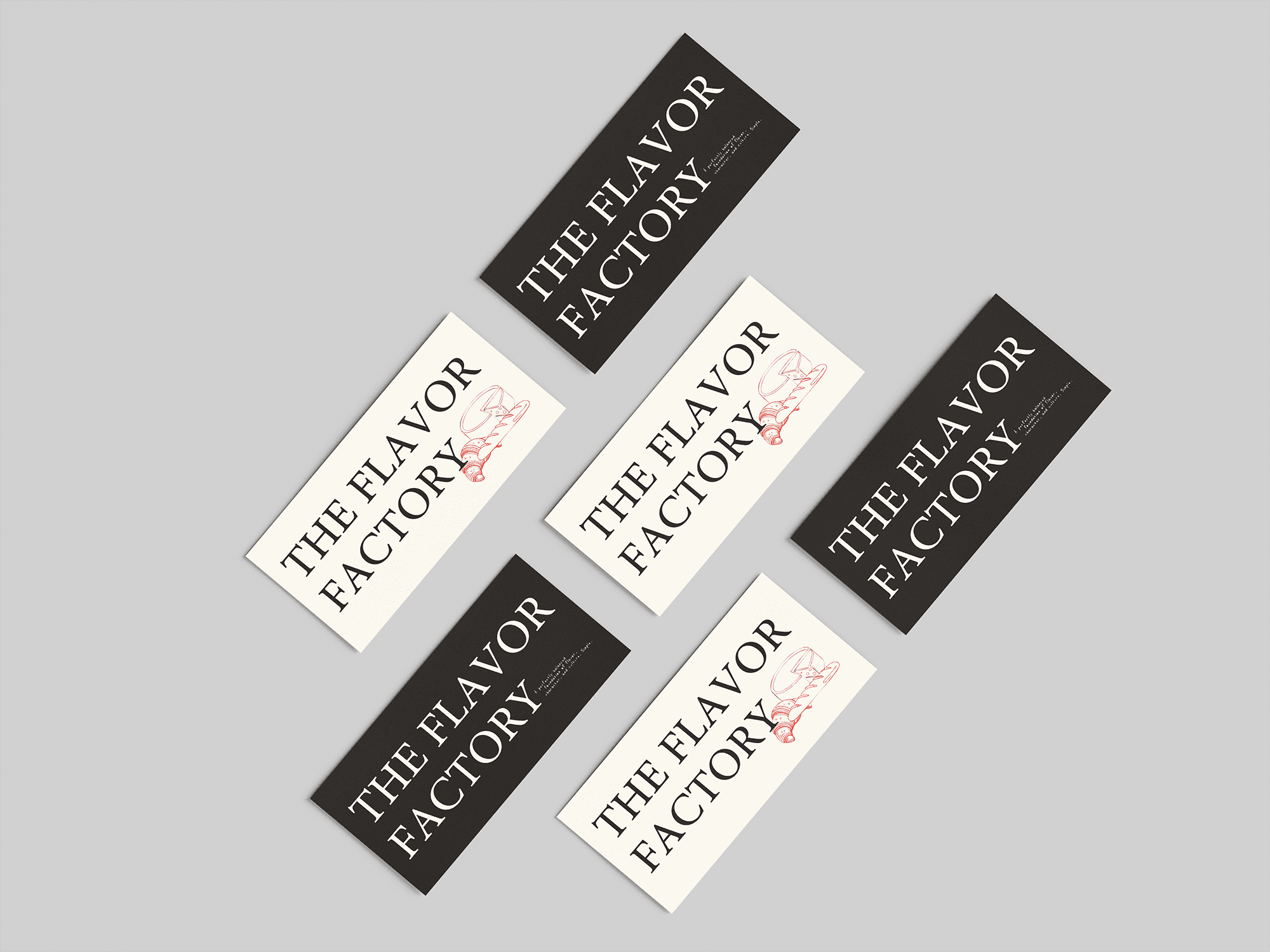
The Flavor Factory
The Flavor Factory, where packaging meets editorial design. A bold, ironic poster that transforms food culture into a layered visual identity.
How We Helped
The Flavor Factory project was conceived as an exploration of packaging through an editorial lens. The challenge was to create a poster that didn’t just display design, but questioned it — blurring the boundaries between product branding, magazine layout, and cultural commentary. To achieve this, we combined structured serif typography with hand-drawn illustrations and raw handwritten elements, giving the piece both elegance and irreverence.
What We Delivered
An editorial-inspired poster with the energy of packaging design
A hybrid typographic system pairing serif structures with handwritten notes
Cultural references and ironic details, from parody-style advisory labels to mock price tags
Layered graphic accents that added depth, personality, and commentary
A final piece that functioned as both visual identity and artistic statement
Impact / Results
Delivered a distinctive poster design that challenged conventional brand collateral
Established The Flavor Factory’s identity as experimental, ironic, and culturally aware
Increased engagement with visually curious audiences, sparking conversations about design as commentary
Positioned the project at the intersection of editorial, packaging, and cultural design trends, with +45% boost in shareability across creative platforms
45%
Boost In Shares